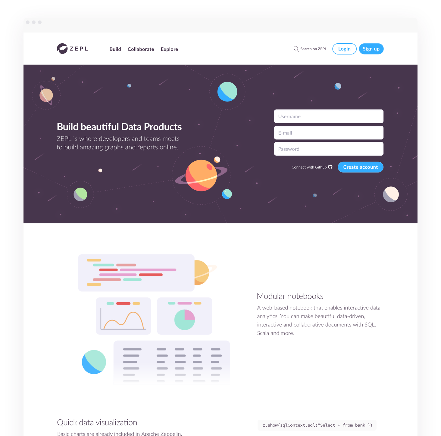
Zepl
THE CHALLENGE
The client asked us to redesign their Big Data platform and make it more user-friendly. The scope of the project was mainly focused on optimizing team collaboration and securing a significant edge over the competition.
It all began with a story
ZEPL was kind of hard to use for new users, so we decided to start from, well, the start. First off, we set out to analyze user roles and define objectives for the product based on their needs.
Easy navigation calls for clear understanding.
With the idea of clarifying the path that users should take to get things done with ZEPL, we created a new set of guidelines for their Brand style. We used bright colors to build a dynamic color palette that would guide users’ decision making process.
Make it memorable
We wanted illustrations to serve as a clean and engaging visual reminder of the potential that Zepl brings to users, while also reassuring them that their data will always be secure.

